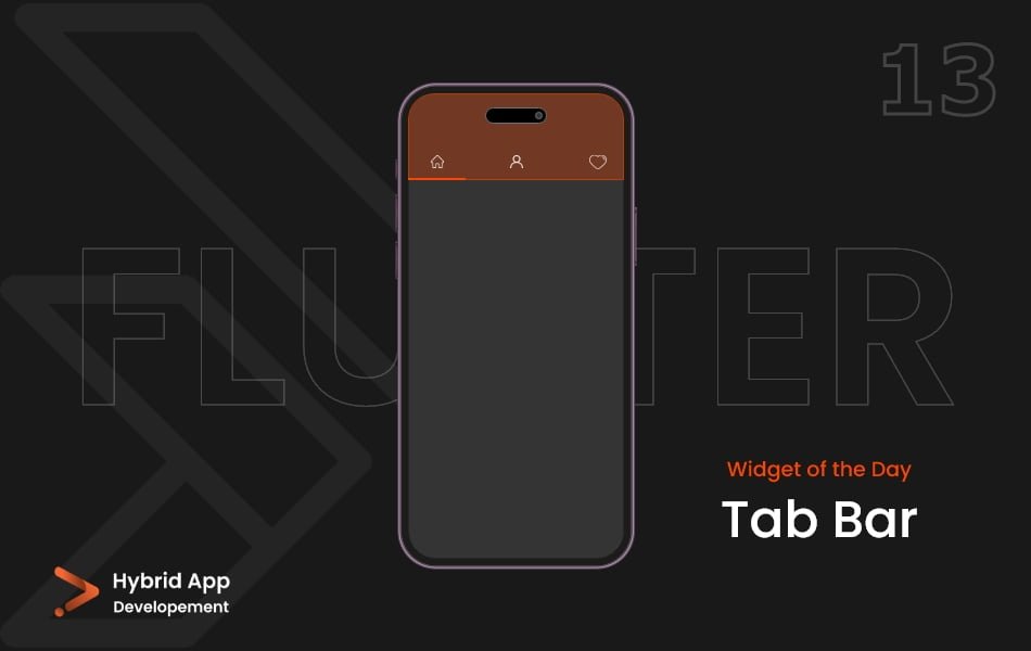
Introdunction of Tab Bar Widget
In Flutter, the Tab Bar widget is a part of the TabBarView system and is commonly used to implement a tabbed interface, allowing users to switch between different sections or views in an app.
Below is a brief explanation of the ‘TabBar’ widget with key properties:
tabs: A list of Tab widgets representing the individual tabs in the tab bar. Each Tab typically includes a text label or an icon.
TabBar(
  tabs: [
    Tab(text: 'Tab 1'),
    Tab(text: 'Tab 2'),
    // Add more tabs as needed
  ],
),
controller: A TabController that manages the state of the TabBar. It allows for synchronization between the TabBar and the TabBarView, ensuring that the correct tab content is displayed.
TabBar(
  controller: myTabController,
  tabs: [
    Tab(text: 'Tab 1'),
    Tab(text: 'Tab 2'),
  ],
),
isScrollable: A boolean value that determines whether the tabs should be scrollable. If set to true, users can horizontally scroll through the tabs if they don’t fit on the screen.
TabBar(
  isScrollable: true,
  tabs: [
    Tab(text: 'Tab 1'),
    Tab(text: 'Tab 2'),
  ],
),
indicatorColor: The color of the underlined indicator that highlights the currently selected tab.
TabBar(
  indicatorColor: Colors.blue,
  tabs: [
    Tab(text: 'Tab 1'),
    Tab(text: 'Tab 2'),
  ],
),
indicatorWeight: The thickness of the underline indicator.
TabBar(
  indicatorWeight: 4.0,
  tabs: [
    Tab(text: 'Tab 1'),
    Tab(text: 'Tab 2'),
  ],
),
labelColor and unselectedLabelColor: The color of the tab label when selected and unselected, respectively.
TabBar(
  labelColor: Colors.blue,
  unselectedLabelColor: Colors.black,
  tabs: [
    Tab(text: 'Tab 1'),
    Tab(text: 'Tab 2'),
  ],
),
labelStyle and unselectedLabelStyle: The text style of the tab label when selected and unselected, respectively.
TabBar(
  labelStyle: TextStyle(fontSize: 16, fontWeight: FontWeight.bold),
  unselectedLabelStyle: TextStyle(fontSize: 14),
  tabs: [
    Tab(text: 'Tab 1'),
    Tab(text: 'Tab 2'),
  ],
),
onTap: A callback function that is triggered when a tab is tapped. It provides the index of the tapped tab.
TabBar(
  onTap: (index) {
    // Handle tab selection
  },
  tabs: [
    Tab(text: 'Tab 1'),
    Tab(text: 'Tab 2'),
  ],
),
Final Code: This is the final code with some of the above Tab Bar widget properties.
import 'package:flutter/material.dart';

class HomePage extends StatelessWidget {
  const HomePage({super.key});

  @override
  Widget build(BuildContext context) {
    return DefaultTabController(
      length: 3,
      child: Scaffold(
        appBar: AppBar(
          title: const Text('T A B B A R'),
        ),
        body: Column(
          children: [
            TabBar(
              tabs: [
                Tab(
                  icon: Icon(
                    Icons.home,
                    color: Colors.black,
                  ),
                ),
                Tab(
                  icon: Icon(
                    Icons.settings,
                    color: Colors.black,
                  ),
                ),
                Tab(
                  icon: Icon(
                    Icons.person,
                    color: Colors.black,
                  ),
                ),
              ],
            ),
            Expanded(
              child: TabBarView(
                children: [
                  Container(
                    color: Colors.deepPurple.shade400,
                    child: Center(
                      child: Text(
                        'Home',
                        style: TextStyle(
                          fontSize: 50,
                          color: Colors.white,
                          fontWeight: FontWeight.w600,
                        ),
                      ),
                    ),
                  ),
                  Container(
                    color: Colors.deepPurple.shade500,
                    child: Center(
                      child: Text(
                        'Settings',
                        style: TextStyle(
                          fontSize: 50,
                          color: Colors.white,
                          fontWeight: FontWeight.w600,
                        ),
                      ),
                    ),
                  ),
                  Container(
                    color: Colors.deepPurple.shade600,
                    child: Center(
                      child: Text(
                        'Users',
                        style: TextStyle(
                          fontSize: 50,
                          color: Colors.white,
                          fontWeight: FontWeight.w600,
                        ),
                      ),
                    ),
                  ),
                ],
              ),
            ),
          ],
        ),
      ),
    );
  }
}
The Tab Bar widget properties allow developers to customize the appearance and behavior of the Tab Bar widget, creating a visually appealing and functional tabbed interface in their Flutter applications.
Thank for visiting Hybrid App Development
Posted by Hussam HM