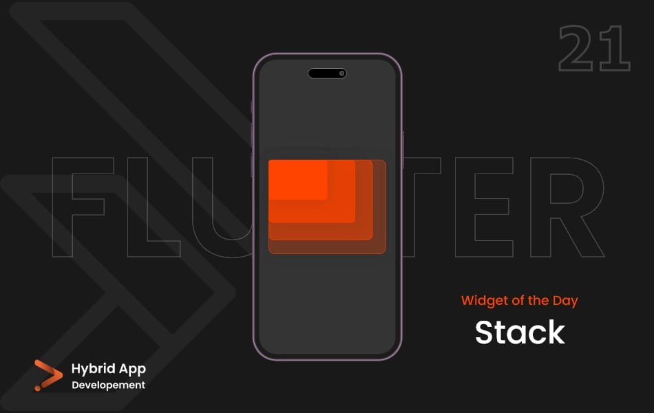
Introduction of Stack Widget
In Flutter, the Stack widget is used to overlay multiple widgets on top of each other. It allows you to position widgets relative to the top, bottom, left, or right edges of the stack or relative to one another. The order in which widgets are added to the stack determines their stacking order, with the last child being visually on top.
Here’s a short explanation of some of the key properties of Stack widget:
alignment Property: Specifies the alignment of the non-positioned and partially positioned children in the stack. The default is AlignmentDirectional.topStart.
Stack(
  alignment: Alignment.center,
  children: [
    // Children widgets
  ],
),
fit Property: Determines how non-positioned children within the stack should be sized. The default is StackFit.loose.
Stack(
  fit: StackFit.expand,
  children: [
    // Children widgets
  ],
),
overflow Property: Defines how overflowing children within the stack should be treated. The default is Overflow.clip.
Stack(
  overflow: Overflow.visible,
  children: [
    // Children widgets
  ],
),
Positioning Children:
To position children within the Stack, you can use the Positioned widget.
top, bottom, left, right Properties: Specifies the distance from the top, bottom, left, or right edges of the stack.
Stack(
  children: [
    Positioned(
      top: 10,
      left: 20,
      child: Container(
        // Positioned child widget
      ),
    ),
  ],
),
width, height Properties: Specifies the width and height of the positioned child.
Stack(
  children: [
    Positioned(
      width: 100,
      height: 100,
      child: Container(
        // Positioned child widget
      ),
    ),
  ],
),
Usage:
Stack(
  alignment: Alignment.center,
  fit: StackFit.expand,
  overflow: Overflow.visible,
  children: [
    Container(color: Colors.blue),
    Positioned(
      top: 50,
      left: 50,
      child: Container(
        width: 100,
        height: 100,
        color: Colors.red,
      ),
    ),
    Positioned(
      bottom: 50,
      right: 50,
      child: Container(
        width: 100,
        height: 100,
        color: Colors.green,
      ),
    ),
  ],
),
Final Code: This is the final code with some of the above Stack widget properties.
import 'package:flutter/material.dart';

class HomePage extends StatefulWidget {
  const HomePage({super.key});

  @override
  State<HomePage> createState() => _HomePageState();
}

class _HomePageState extends State<HomePage> {
  @override
  Widget build(BuildContext context) {
    return Scaffold(
      backgroundColor: Color.fromARGB(255, 24, 24, 24),
      body: Stack(
        alignment: AlignmentDirectional.topStart,
        children: [
          Container(
            height: 300,
            width: 300,
            color: Colors.blue[200],
          ),
          Container(
            height: 200,
            width: 200,
            color: Colors.blue[400],
          ),
          Container(
            height: 100,
            width: 100,
            color: Colors.blue[600],
          ),
        ],
      ),
    );
  }
}
Thank for visiting Hybrid App Development
Posted by Hussam HM


