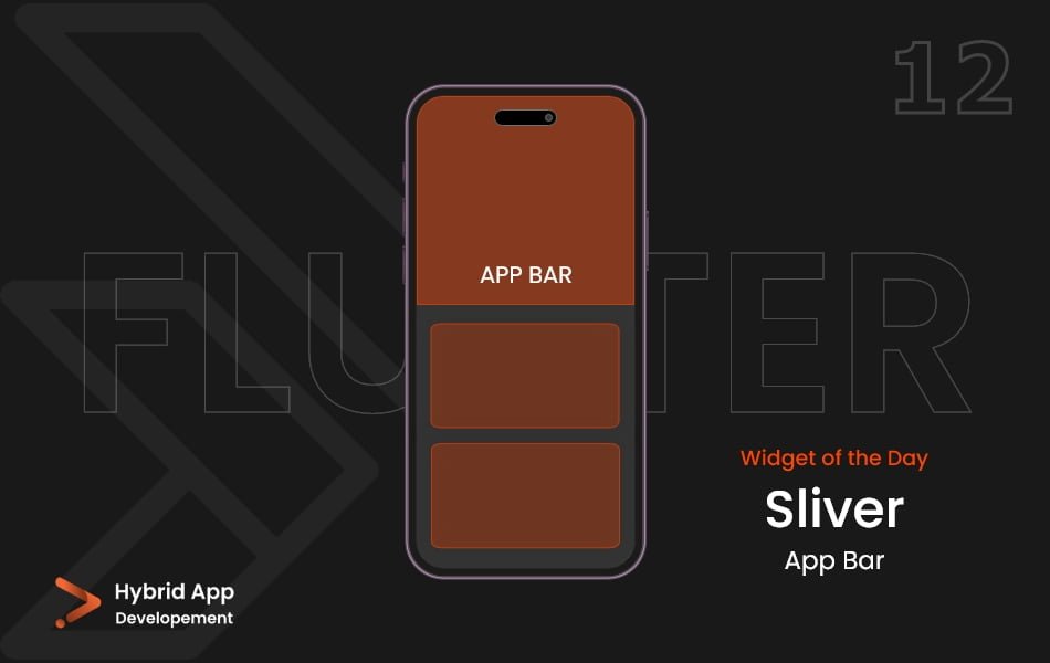
Introduction of Sliver Appbar Widget
In Flutter, the Sliver AppBar widget is used to create an app bar that integrates with CustomScrollView and provides various scrolling effects. It is particularly useful for creating flexible app bar designs that respond to scrolling gestures.
Below is a brief explanation of the Sliver AppBar widget with key properties:
expandedHeight: The maximum height of the app bar when it is fully expanded. This property determines the initial height of the app bar before any scrolling occurs.
SliverAppBar(
  expandedHeight: 200,
  // Other properties...
),
floating: A boolean value indicating whether the app bar should become visible and pinned as the user scrolls down. When set to true, the app bar will appear when the user starts scrolling.
SliverAppBar(
  floating: true,
  // Other properties...
),
pinned: A boolean value indicating whether the app bar should remain pinned at the top of the screen after the user scrolls. If set to true, the app bar will stay fixed at the top.
SliverAppBar(
  pinned: true,
  // Other properties...
),
snap: A boolean value indicating whether the app bar should snap into view when the user scrolls up. If set to true, the app bar will either be fully visible or fully invisible.
SliverAppBar(
  snap: true,
  // Other properties...
),
title: The title to be displayed within the app bar. Typically, a Text widget or another widget that represents the title.
SliverAppBar(
  title: Text('My App'),
  // Other properties...
),
flexibleSpace: A widget that provides a flexible space within the app bar. It can include elements like images, gradients, or other widgets for a customized appearance.
SliverAppBar(
  flexibleSpace: MyFlexibleSpaceWidget(),
  // Other properties...
),
actions: A list of widgets representing actions to be displayed on the right side of the app bar. Typically, IconButton or other action-related widgets.
SliverAppBar(
  actions: [
    IconButton(
      icon: Icon(Icons.search),
      onPressed: () {
        // Handle search action
      },
    ),
    // Add more actions as needed
  ],
  // Other properties...
),
Final Code: This is the final code with some of the above Sliver AppBar Widget properties.
import 'package:flutter/material.dart';

class HomePage extends StatelessWidget {
  const HomePage({super.key});

  @override
  Widget build(BuildContext context) {
    return Scaffold(
      backgroundColor: Color.fromARGB(255, 233, 214, 196),
      body: CustomScrollView(
        slivers: [
          SliverAppBar(
            backgroundColor: Color.fromARGB(255, 191, 60, 0),
            leading: const Icon(Icons.menu),
            pinned: true,
            expandedHeight: 300,
            flexibleSpace: FlexibleSpaceBar(
              background: Container(
                color: Color.fromARGB(255, 191, 60, 0),
              ),
              title: const Text('S L I V E R A P P B A R'),
            ),
          ),
          SliverToBoxAdapter(
            child: Padding(
              padding: const EdgeInsets.all(20.0),
              child: ClipRRect(
                borderRadius: BorderRadius.circular(15),
                child: Container(
                  height: 400,
                  color: Color.fromARGB(255, 205, 145, 117),
                ),
              ),
            ),
          ),
          SliverToBoxAdapter(
            child: Padding(
              padding: const EdgeInsets.all(20.0),
              child: ClipRRect(
                borderRadius: BorderRadius.circular(15),
                child: Container(
                  height: 400,
                  color: Color.fromARGB(255, 205, 145, 117),
                ),
              ),
            ),
          ),
          SliverToBoxAdapter(
            child: Padding(
              padding: const EdgeInsets.all(20.0),
              child: ClipRRect(
                borderRadius: BorderRadius.circular(15),
                child: Container(
                  height: 400,
                  color: Color.fromARGB(255, 205, 145, 117),
                ),
              ),
            ),
          ),
          SliverToBoxAdapter(
            child: Padding(
              padding: const EdgeInsets.all(20.0),
              child: ClipRRect(
                borderRadius: BorderRadius.circular(15),
                child: Container(
                  height: 400,
                  color: Color.fromARGB(255, 205, 145, 117),
                ),
              ),
            ),
          ),
          SliverToBoxAdapter(
            child: Padding(
              padding: const EdgeInsets.all(20.0),
              child: ClipRRect(
                borderRadius: BorderRadius.circular(15),
                child: Container(
                  height: 400,
                  color: Color.fromARGB(255, 205, 145, 117),
                ),
              ),
            ),
          ),
          SliverToBoxAdapter(
            child: Padding(
              padding: const EdgeInsets.all(20.0),
              child: ClipRRect(
                borderRadius: BorderRadius.circular(15),
                child: Container(
                  height: 400,
                  color: Color.fromARGB(255, 205, 145, 117),
                ),
              ),
            ),
          ),
        ],
      ),
    );
  }
}
The Sliver AppBar Widget properties allow developers to create dynamic and visually appealing app bar designs that respond to user interactions and scrolling behavior. The Sliver AppBar Widget is commonly used in conjunction with a CustomScrollView to achieve more advanced scrolling effects in Flutter applications.
Thank for visiting Hybrid App Development
Posted by Hussam HM


