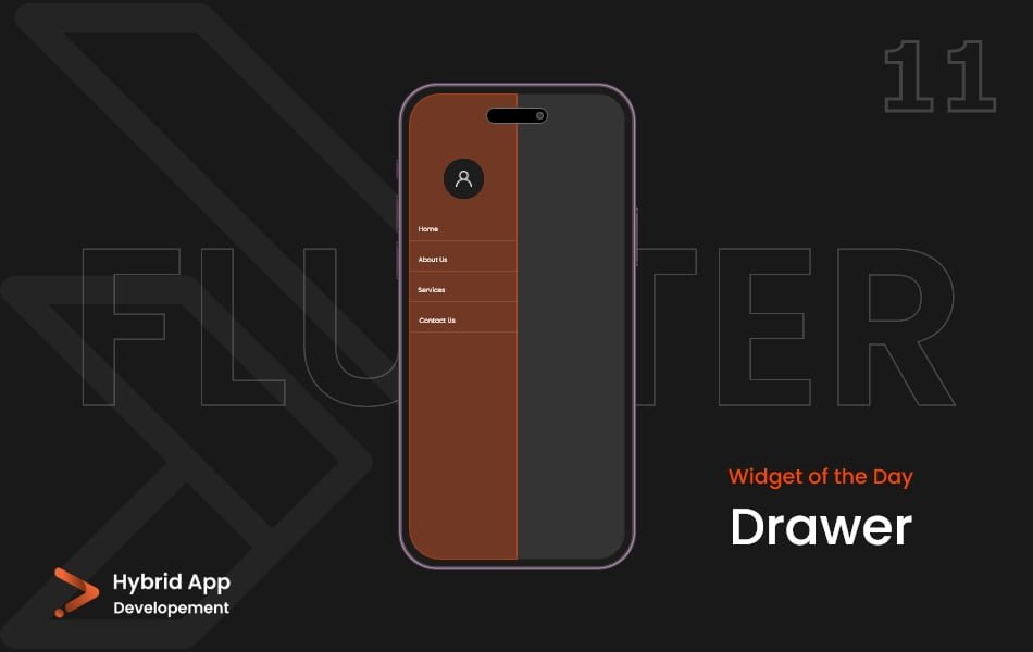
Introduction of Drawer Widget
In Flutter, the Drawer widget is used to implement a slide-in menu or navigation panel that is typically hidden off-screen and can be revealed by swiping or tapping. It is commonly used to provide navigation options, settings, or other auxiliary functionality within an app.
Below is a brief explanation of the Drawer widget with key properties:
child: The primary widget that defines the content of the drawer. This widget can contain various UI elements like ListView, Column, or other widgets to structure the drawer’s content.
Drawer(
  child: ListView(
    children: [
      // Drawer content goes here
    ],
  ),
),
elevation: The elevation of the drawer, controlling the shadow intensity. A higher elevation gives the illusion of the drawer being on top of the content.
Drawer(
  elevation: 16.0,
  child: ListView(
    children: [
      // Drawer content goes here
    ],
  ),
),
semanticLabel: A label for accessibility purposes that describes the purpose of the drawer. It is announced to screen readers.
Drawer(
  semanticLabel: 'Navigation Drawer',
  child: ListView(
    children: [
      // Drawer content goes here
    ],
  ),
),
onDrawerChanged: A callback that is invoked when the drawer’s position changes, either opened or closed. It provides a boolean indicating whether the drawer is now open.
Drawer(
  onDrawerChanged: (isDrawerOpen) {
    // Handle drawer state change
  },
  child: ListView(
    children: [
      // Drawer content goes here
    ],
  ),
),
scrollController: A controller that can be used to control the position of the drawer content when the drawer is open. Useful for programmatically scrolling the content.
Drawer(
  scrollController: myScrollController,
  child: ListView(
    children: [
      // Drawer content goes here
    ],
  ),
),
drawerCallback: A callback function that is invoked when the drawer is opened or closed. It provides a ‘DragEndDetails’ object with details about the drag gesture.
Drawer(
  drawerCallback: (isOpen) {
    // Handle drawer open/close
  },
  child: ListView(
    children: [
      // Drawer content goes here
    ],
  ),
),
Final Code: This is the final code with some of the above Drawer Widget properties.
import 'package:flutter/material.dart';

import 'pages/aboutpage.dart';
import 'pages/homepage.dart';

void main() {
  runApp(const MyApp());
}

class MyApp extends StatelessWidget {
  const MyApp({super.key});

  // This widget is the root of your application.
  @override
  Widget build(BuildContext context) {
    return MaterialApp(
      debugShowCheckedModeBanner: false,
      home: Scaffold(
        appBar: AppBar(
          backgroundColor: Color.fromARGB(255, 30, 30, 30),
        ),
        drawer: Drawer(
          child: Container(
            color: const Color.fromARGB(255, 29, 29, 29),
            child: ListView(
              children: [
                const DrawerHeader(
                  child: Center(
                    child: Text(
                      'L O G O',
                      style: TextStyle(fontSize: 35, color: Colors.white),
                    ),
                  ),
                ),
                ListTile(
                  leading: const Icon(
                    Icons.home,
                    color: Colors.white,
                  ),
                  title: const Text(
                    'Home',
                    style: TextStyle(fontSize: 20, color: Colors.white),
                  ),
                  onTap: () => Navigator.of(context).push(
                    MaterialPageRoute(builder: (context) => HomePage()),
                  ),
                ),
                ListTile(
                  leading: const Icon(
                    Icons.home,
                    color: Colors.white,
                  ),
                  title: const Text(
                    'About Page',
                    style: TextStyle(fontSize: 20, color: Colors.white),
                  ),
                  onTap: () => Navigator.of(context).push(
                    MaterialPageRoute(builder: (context) => AboutPage()),
                  ),
                ),
              ],
            ),
          ),
        ),
        endDrawer: const Drawer(
          backgroundColor: Color.fromARGB(255, 66, 66, 66),
        ),
      ),
    );
  }
}
These properties provide customization and control over the appearance and behavior of the Drawer widget, allowing developers to implement various designs for navigation and additional functionality in their Flutter applications.
Thank for visiting Hybrid App Development
Posted by Hussam HM


