Introdunction of Bottom Navbar Widget
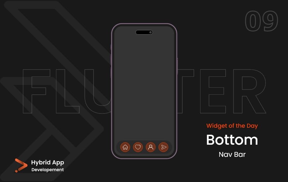
In Flutter, the Bottom Navbar Widget is used to create a navigation bar at the bottom of the screen, typically for switching between different views or pages in the app. It provides a convenient way to navigate between major sections of an application.
Below is a brief explanation of the Bottom Navbar Widget widget with key properties:
items: A list of BottomNavigationBarItem objects, each representing a tab in the navigation bar. Each item typically includes an icon and a label.
BottomNavigationBar(
  items: [
    BottomNavigationBarItem(
      icon: Icon(Icons.home),
      label: 'Home',
    ),
    BottomNavigationBarItem(
      icon: Icon(Icons.search),
      label: 'Search',
    ),
    // Add more items as needed
  ],
),
currentIndex: The index of the currently selected tab. This property allows you to programmatically control which tab is active.
BottomNavigationBar(
  currentIndex: _currentIndex,
  items: [
    // ...
  ],
  onTap: (index) {
    // Handle tab selection
    setState(() {
      _currentIndex = index;
    });
  },
),
onTap: A callback function that is triggered when a tab is tapped. It provides the index of the tapped tab, allowing you to update the UI accordingly.
BottomNavigationBar(
  items: [
    // ...
  ],
  onTap: (index) {
    // Handle tab selection
  },
),
type: Specifies the layout and behavior of the navigation bar. Options include BottomNavigationBarType.fixed for a fixed-size bar and BottomNavigationBarType.shifting for a shifting bar with animations.
BottomNavigationBar(
  type: BottomNavigationBarType.fixed,
  items: [
    // ...
  ],
),
backgroundColor: The background color of the bottom navbar widget.
BottomNavigationBar(
  backgroundColor: Colors.blue,
  items: [
    // ...
  ],
),
elevation: The elevation of the navigation bar, controlling the shadow intensity.
BottomNavigationBar(
  elevation: 8.0,
  items: [
    // ...
  ],
),
fixedColor: The color of the selected tab’s icon and label when using BottomNavigationBarType.fixed.
BottomNavigationBar(
  fixedColor: Colors.red,
  items: [
    // ...
  ],
),
selectedFontSize and unselectedFontSize: Font size for the selected and unselected tab labels.
BottomNavigationBar(
  selectedFontSize: 16.0,
  unselectedFontSize: 14.0,
  items: [
    // ...
  ],
),
Final Code: This is the final code with some of the above properties.
import 'package:flutter/material.dart';

class HomePage extends StatefulWidget {
  const HomePage({super.key});

  @override
  State<HomePage> createState() => _HomePageState();
}

class _HomePageState extends State<HomePage> {
  int _indexNum = 0;

  void _onChangeIndex(int index) {
    setState(() {
      _indexNum = index;
    });
  }

  final List<Widget> _pages = [
    const Center(
      child: Text(
        'Home',
        style: TextStyle(
          fontSize: 30,
        ),
      ),
    ),
    const Center(
      child: Text(
        'Search',
        style: TextStyle(
          fontSize: 30,
        ),
      ),
    ),
    const Center(
      child: Text(
        'Account',
        style: TextStyle(
          fontSize: 30,
        ),
      ),
    ),
  ];

  @override
  Widget build(BuildContext context) {
    return Scaffold(
      body: _pages[_indexNum],
      bottomNavigationBar: BottomNavigationBar(
        currentIndex: _indexNum,
        onTap: _onChangeIndex,
        items: const [
          BottomNavigationBarItem(
            icon: Icon(Icons.home),
            label: 'Home',
          ),
          BottomNavigationBarItem(
            icon: Icon(Icons.search),
            label: 'Search',
          ),
          BottomNavigationBarItem(
            icon: Icon(Icons.account_circle_outlined),
            label: 'Account',
          ),
          // Add more items as needed
        ],
      ),
    );
  }
}
These properties allow you to customize the appearance and behavior of the Bottom Navbar Widget to suit the design and functionality of your Flutter app. The widget is commonly used in conjunction with a TabBarView to manage the content associated with each tab.
Thank for visiting Hybrid App Development
Posted by Hussam HM


