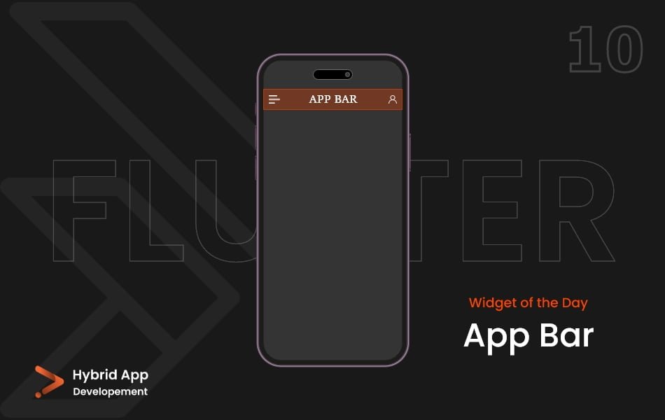
Introduction of AppBar Widget
In Flutter, the term “top bar” is often associated with the AppBar widget. The AppBar Widget is a fundamental component used for building the top-level app bars in Flutter applications. It provides a consistent and customizable way to present navigation, titles, and actions at the top of the screen.
Below is a brief explanation of the AppBar widget with key properties:
title: The main title of the app bar, typically displayed at the center.
AppBar(
  title: Text('My App'),
),
actions: A list of widgets that represent actions to be placed on the right side of the app bar.
AppBar(
  actions: [
    IconButton(
      icon: Icon(Icons.search),
      onPressed: () {
        // Handle search action
      },
    ),
    // Add more actions as needed
  ],
),
leading: A widget to be placed on the left side of the app bar. Commonly used for a back button or menu icon.
AppBar(
  leading: IconButton(
    icon: Icon(Icons.menu),
    onPressed: () {
      // Handle menu action
    },
  ),
),
backgroundColor: The background color of the app bar.
AppBar(
  backgroundColor: Colors.blue,
),
elevation: The elevation of the app bar, controlling the shadow intensity.
AppBar(
  elevation: 4.0,
),
brightness: The brightness of the app bar, either Brightness.light or Brightness.dark.
AppBar(
  systemOverlayStyle: SystemUiOverlayStyle.light,
),
iconTheme: The color, opacity, and size of icons within the app bar.
AppBar(
  iconTheme: IconThemeData(
    color: Colors.white,
    size: 24.0,
  ),
),
centerTitle: Whether the title should be centered. If set to false, the title will be aligned to the start.
AppBar(
  centerTitle: false,
),
automaticallyImplyLeading: Controls whether the leading widget (usually a back button) should be automatically inferred.
AppBar(
  automaticallyImplyLeading: true,
),
Final Code: This is the final code with some of the above AppBar Widget properties.
import 'package:flutter/material.dart';

void main() {
  runApp(const MyApp());
}

class MyApp extends StatelessWidget {
  const MyApp({super.key});

  // This widget is the root of your application.
  @override
  Widget build(BuildContext context) {
    return MaterialApp(
      debugShowCheckedModeBanner: false,
      theme: ThemeData(primarySwatch: Colors.teal),
      home: Scaffold(
        appBar: AppBar(
          backgroundColor: Colors.blueAccent,
          elevation: 0,
          title: const Center(child: Text('A P P B A R')),
          leading: IconButton(
            onPressed: () {},
            icon: const Icon(Icons.menu),
          ),
          actions: [
            IconButton(
              onPressed: () {},
              icon: const Icon(Icons.person),
            ),
          ],
        ),
      ),
    );
  }
}
These properties allow you to customize the appearance and behavior of the AppBar to suit the design and functionality of your Flutter app. The AppBar widget is commonly used at the top of the screen to provide a consistent navigation and branding experience.
Thank for visiting Hybrid App Development
Posted by Hussam HM


