Introduction of AlertDialog Widget
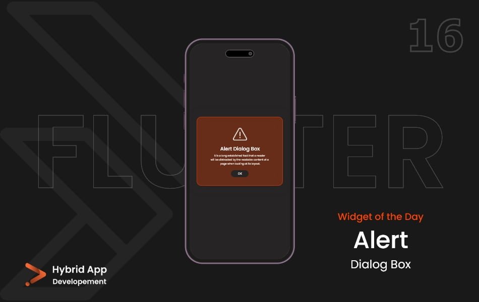
In Flutter, the AlertDialog widget is a component that displays a modal dialog to the user. It is commonly used to convey important information, prompt the user for input, or confirm an action. The AlertDialog is part of the material design components and provides a straightforward way to present dialog boxes in your app.
Below is a brief explanation of the AlertDialog widget with key properties:
title Property: Represents the title of the dialog, typically displayed at the top. It accepts a Text widget or any other widget.
AlertDialog(
  title: Text('Alert Title'),
  // Other properties...
),
content Property: Represents the main content of the dialog. It can include text, images, or other widgets.
AlertDialog(
  content: Text('This is the main content of the alert.'),
  // Other properties...
),
actions Property: Represents a list of buttons or actions that the user can take. It is typically an array of FlatButton or ElevatedButton widgets.
AlertDialog(
  actions: [
    ElevatedButton(
      onPressed: () {
        // Handle action
      },
      child: Text('OK'),
    ),
    // Add more buttons as needed
  ],
  // Other properties...
),
shape Property: Allows customizing the shape of the dialog. It can be used to give the dialog rounded corners or other custom shapes.
AlertDialog(
  shape: RoundedRectangleBorder(
    borderRadius: BorderRadius.circular(10.0),
  ),
  // Other properties...
),
backgroundColor Property: Sets the background color of the dialog.
AlertDialog(
  backgroundColor: Colors.grey,
  // Other properties...
),
elevation Property: Sets the elevation of the dialog. Elevation determines the shadow cast by the dialog.
AlertDialog(
  elevation: 8.0,
  // Other properties...
),
scrollable Property: If set to true, allows the content of the dialog to be scrollable.
AlertDialog(
  scrollable: true,
  // Other properties...
),
contentPadding Property: Defines the padding around the content of the dialog.
AlertDialog(
  contentPadding: EdgeInsets.all(16.0),
  // Other properties...
),
Usage: Here’s a basic example of using AlertDialog:
AlertDialog(
  title: Text('Alert Title'),
  content: Text('This is the main content of the alert.'),
  actions: [
    ElevatedButton(
      onPressed: () {
        // Handle action
      },
      child: Text('OK'),
    ),
  ],
),
Final Code: This is the final code with some of the above AlertDialog widget properties.
import 'package:flutter/material.dart';

class HomePage extends StatefulWidget {
  const HomePage({super.key});

  @override
  State<HomePage> createState() => _HomePageState();
}

class _HomePageState extends State<HomePage> {
  void _showDialogBox() {
    showDialog(
      context: context,
      builder: (context) {
        return AlertDialog(
          backgroundColor: Colors.pinkAccent[100],
          title: Text('Title'),
          content: Text('Content, more info'),
          actions: [
            MaterialButton(
              onPressed: () {},
              child: Text('Ok'),
            ),
            MaterialButton(
              onPressed: () {
                Navigator.pop(context);
              },
              child: Text('Cancel'),
            )
          ],
        );
      },
    );
  }

  @override
  Widget build(BuildContext context) {
    return Scaffold(
      backgroundColor: Colors.deepPurple[200],
      body: Center(
        child: MaterialButton(
          color: Colors.deepPurple[300],
          child: Padding(
            padding: EdgeInsets.all(15.0),
            child: Text(
              'Show Dialog',
              style: TextStyle(fontSize: 20),
            ),
          ),
          onPressed: _showDialogBox,
        ),
      ),
    );
  }
}
This AlertDialog widget will display a title, content, and an “OK” button. Developers can customize the appearance and behavior of the dialog to suit the specific needs of their application.
Thank for visiting Hybrid App Development
Posted by Hussam HM


