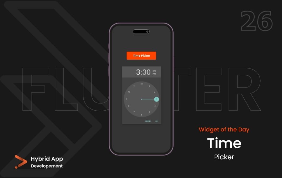
Introduction of TimePicker Widget
The TimePicker widget in Flutter enables users to select a specific time using an interactive interface. It’s commonly used for tasks like setting alarms, scheduling events, or specifying time-based reminders.
Below are key properties of the TimePicker widget:
initialTime Property: Specifies the initial time to display when the time picker opens. It’s typically set to the current time.
showTimePicker(
  context: context,
  initialTime: TimeOfDay.now(),
  // Other properties...
)
helpText Property: Sets the help text displayed above the time picker dialog, providing instructions or guidance to users.
showTimePicker(
  context: context,
  helpText: 'Select your preferred time',
  // Other properties...
)
builder Property: Allows customization of the time picker dialog’s appearance and behavior by providing a custom widget builder.
showTimePicker(
  context: context,
  builder: (context, child) {
    return CustomTimePickerDialog(
      // Custom dialog widget...
    );
  },
  // Other properties...
)
useRootNavigator Property: Specifies whether the navigator that owns the dialog should be used to route the dialog to the screen.
showTimePicker(
  context: context,
  useRootNavigator: true,
  // Other properties...
)
initialEntryMode Property: Determines the input mode when the time picker is first displayed. It can be TimePickerEntryMode.inputField or TimePickerEntryMode.dial.
showTimePicker(
  context: context,
  initialEntryMode: TimePickerEntryMode.dial,
  // Other properties...
)
initialEntryMode Property: Specifies the initial entry mode when the time picker is displayed. It can be TimePickerMode.hour or TimePickerMode.minute.
showTimePicker(
  context: context,
  initialTime: TimeOfDay.now(),
  initialEntryMode: TimePickerMode.hour,
  // Other properties...
)
Usage:
showTimePicker(
  context: context,
  initialTime: TimeOfDay.now(),
  helpText: 'Select your preferred time',
  useRootNavigator: true,
  initialEntryMode: TimePickerEntryMode.dial,
  builder: (context, child) {
    return CustomTimePickerDialog(
      // Custom dialog widget...
    );
  },
)
Final Code: This is the final code with some of the above properties.
import 'package:flutter/material.dart';

class HomePage extends StatefulWidget {
  const HomePage({super.key});

  @override
  State<HomePage> createState() => _HomePageState();
}

class _HomePageState extends State<HomePage> {
  TimeOfDay _timeOfDay = TimeOfDay(hour: 8, minute: 30);

  void _showTimePicker() {
    showTimePicker(
      context: context,
      initialTime: TimeOfDay.now(),
    ).then((value) {
      setState(() {
        _timeOfDay = value!;
      });
    });
  }

  @override
  Widget build(BuildContext context) {
    return Scaffold(
      body: Center(
        child: Column(
          mainAxisAlignment: MainAxisAlignment.spaceEvenly,
          crossAxisAlignment: CrossAxisAlignment.center,
          children: [
            Text(
              _timeOfDay.format(context).toString(),
              style: TextStyle(
                fontSize: 20,
              ),
            ),
            MaterialButton(
              onPressed: _showTimePicker,
              child: Padding(
                padding:
                    const EdgeInsets.symmetric(vertical: 15, horizontal: 25),
                child: Text(
                  'Pick a Time',
                  style: TextStyle(
                    fontSize: 20,
                  ),
                ),
              ),
              color: Colors.teal,
            ),
          ],
        ),
      ),
    );
  }
}
In this example, a showTimePicker function is called to display a time picker with various properties set in TimePicker widget, including the initial time, help text, root navigator usage, entry mode, and builder for customization. Adjust these properties based on your application’s requirements for selecting time input.
Thank for visiting Hybrid App Development
Posted by Hussam HM


