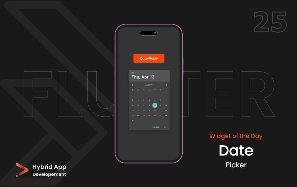
Introduction of DatePicker Widget
The DatePicker widget in Flutter allows users to select a date from a calendar-style interface. It’s a convenient way to capture dates for various use cases like scheduling appointments, setting reminders, or selecting birthdates.
Below are some key properties of the DatePicker widget:
initialDate Property: Specifies the initial date to display when the date picker opens. It’s usually set to the current date.
showDatePicker(
  context: context,
  initialDate: DateTime.now(),
  // Other properties...
)
firstDate and lastDate Properties: Define the range of selectable dates. Users cannot choose dates outside this range.
showDatePicker(
  context: context,
  initialDatePickerMode: DatePickerMode.year,
  // Other properties...
)
initialDatePickerMode Property: Determines whether the date picker initially opens in DatePickerMode.day, DatePickerMode.year, or DatePickerMode.month.
showDatePicker(
  context: context,
  initialDatePickerMode: DatePickerMode.year,
  // Other properties...
)
selectableDayPredicate Property: A function that determines which dates are selectable. It allows you to customize date selection based on specific conditions.
showDatePicker(
  context: context,
  selectableDayPredicate: (DateTime date) {
    // Custom logic to allow/disallow date selection
    return true;
  },
  // Other properties...
)
onDateChanged Callback: Called whenever the selected date changes. It provides the newly selected date.
showDatePicker(
  context: context,
  onDateChanged: (selectedDate) {
    print('Selected date: $selectedDate');
  },
  // Other properties...
)
initialEntryMode Property: Specifies the input mode when the date picker is first displayed. It can be DatePickerEntryMode.inputField, DatePickerEntryMode.calendar, or DatePickerEntryMode.calendarOnly.
showDatePicker(
  context: context,
  initialEntryMode: DatePickerEntryMode.inputField,
  // Other properties...
)
Usage:
showDatePicker(
  context: context,
  initialDate: DateTime.now(),
  firstDate: DateTime(2022),
  lastDate: DateTime(2025),
  initialDatePickerMode: DatePickerMode.day,
  selectableDayPredicate: (DateTime date) {
    // Custom logic to allow/disallow date selection
    return true;
  },
  onDateChanged: (selectedDate) {
    print('Selected date: $selectedDate');
  },
  initialEntryMode: DatePickerEntryMode.calendar,
)
Final Code: This is the final code with some of the above properties.
import 'package:flutter/material.dart';

class HomePage extends StatefulWidget {
  const HomePage({super.key});

  @override
  State<HomePage> createState() => _HomePageState();
}

class _HomePageState extends State<HomePage> {
  DateTime _dateTime = DateTime.now();

  void _showDataPicker() {
    showDatePicker(
      context: context,
      initialDate: DateTime.now(),
      firstDate: DateTime(1940),
      lastDate: DateTime(2050),
    ).then((value) {
      setState(() {
        _dateTime = value!;
      });
    });
  }

  @override
  Widget build(BuildContext context) {
    return Scaffold(
      body: Center(
        child: Column(
          mainAxisAlignment: MainAxisAlignment.spaceEvenly,
          crossAxisAlignment: CrossAxisAlignment.center,
          children: [
            Text(
              _dateTime.toString(),
              style: TextStyle(fontSize: 40),
            ),
            MaterialButton(
              onPressed: _showDataPicker,
              color: const Color.fromARGB(255, 1, 68, 53),
              child: const Padding(
                padding: EdgeInsets.symmetric(vertical: 15.0, horizontal: 30),
                child: Text(
                  'Pick a Date',
                  style: TextStyle(
                    fontSize: 20,
                    color: Colors.white,
                  ),
                ),
              ),
            ),
          ],
        ),
      ),
    );
  }
}
In this example, a showDatePicker function is called to display a date picker with various properties set of DatePicker widget, including the initial date, range of selectable dates, initial mode, selectable day predicate, callback for date changes, and initial entry mode. Customize these properties based on your application’s requirements for capturing date input.
Thank for visiting Hybrid App Development
Posted by Hussam HM